In this series of posts, we’re looking at student workload mapping. This second post explains how we monitor workload during module design, and where we might make recommendations to authors.
Overall workload for a module is agreed right at the beginning of learning design, with set times to aim for based on the level of study, credits and duration of a module. In our first post in this series we looked at the case of Alex, and the 3 week workload lump. With that level 1, 60 credit 30 week module, the weekly workload should have looked something like this:
Module directed workload: 13 hours
Student directed workload: 7 hours
Total workload: 20 hours
This balance is taken in to consideration when planning the overall structure of a module, with authors dividing topics, units and blocks across the 30 weeks in as even a distribution as possible.
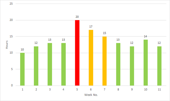
Slight variations in the workload are to be expected, and can creep in unknowingly during drafting, where authors start blocking out the details of teaching activities. Detailed workload mapping starts here, with an aim to informing tweaks for the next sets of drafts. If we take another look at Alex’s module, the results might look something like this:

So, how do we go about it?
The process changes slightly as a module fills out and nears presentation, but the core elements of mapping are:
- Word counts
- Reading speeds
- Multimedia assets
- Directed activities
Word counts are a good early measure for study time, with text often representing a sizable chunk of teaching in distance education. This is based on estimated Reading speeds for different types of content. Introductory material might be read at ‘normal’ speed, while high cognitive load sections (dense definitions or models that might need slower or multiple readings) will need more time allocated per-word.
Multimedia assets including AV material are mapped based on their duration, multiplied by two, allowing for pausing and taking notes. Images receive a flat figure depending on their nature, with less time allocated for decorative or illustrative images than detailed infographics and diagrams.
Directed activities are written with an estimated time as part of best practice (E.g. Activity 1.1 – 40 minutes), which we then sense-check and use for mapping. While doing so, we also look at the different types of activities being used, categorising them as we go. We’ll look at this more as part of the final post in the series.
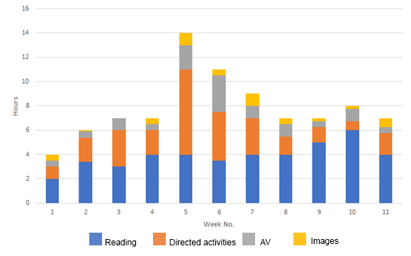
At the end, we are able to see not just the workload of a module, but also the top-level composition:

As you can see, text/reading content accounts for a large proportion of the workload in Alex’s module. We can now see though that the crunch points in weeks 5 and 6 are largely due to higher proportions of directed activities and AV content. Our feedback for the next phase of drafting would be to:
- Week 1 may benefit from slightly more study time to help quickly acclimatise level 1 students to the expected 7 hour mark (perhaps 1 more hour). Check that induction and studentship activities have been accounted for.
- Look to reduce overall workload for weeks 5 and 6. Planned activities and AV currently account for a disproportionate amount.
- Week 10 may be a little text heavy, which could affect engagement.
How much we map is often down to the specific needs of the module. In some cases, the first 7 weeks will give enough of an idea to even out the workload as the rest of it develops. In other cases, the full module is mapped out to look for peaks and troughs.
Fortunately, in the case of Alex’s module, the crunch in week 5 is identified early, and is smoothed out in subsequent drafts before first presentation. Alex has a consistent experience, a better work/life/study balance, and the quality of learning and teaching itself once again becomes the primary determinant of success.
In the final post in this series, we’ll look at how we use mapping data to measure concurrency (multiple module study) and activities – and the opportunities that opens up.

Comments are closed, but trackbacks and pingbacks are open.